Designing a chart library for native mobile apps
Sections of this case study
Project overview & my role
My team created a design language for the mobile enterprise
We worked in close partnership with Apple to define the appearance, behavior, and rules behind this enterprise design system.

I worked to bring charts into the design language
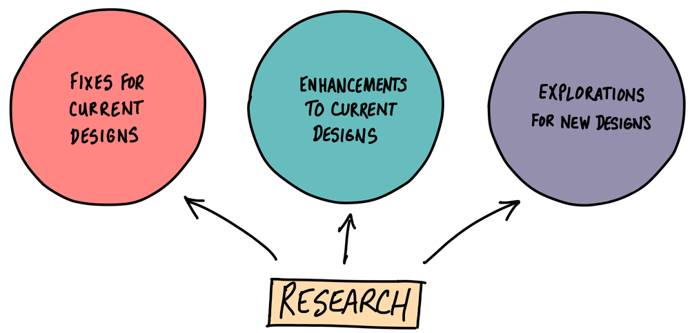
It all began with (some) research
My role evoled over time
After starting in a supporting role to a Senior UX Designer, I eventually became the team's lead designer for charts.
Under the guidance of a design lead, I worked closely with one other designer, as well as with a developer and an architect.
We gathered insights from multiple partners
Through conversations with a number of groups at SAP and Apple, we learned about our topic from various viewpoints.
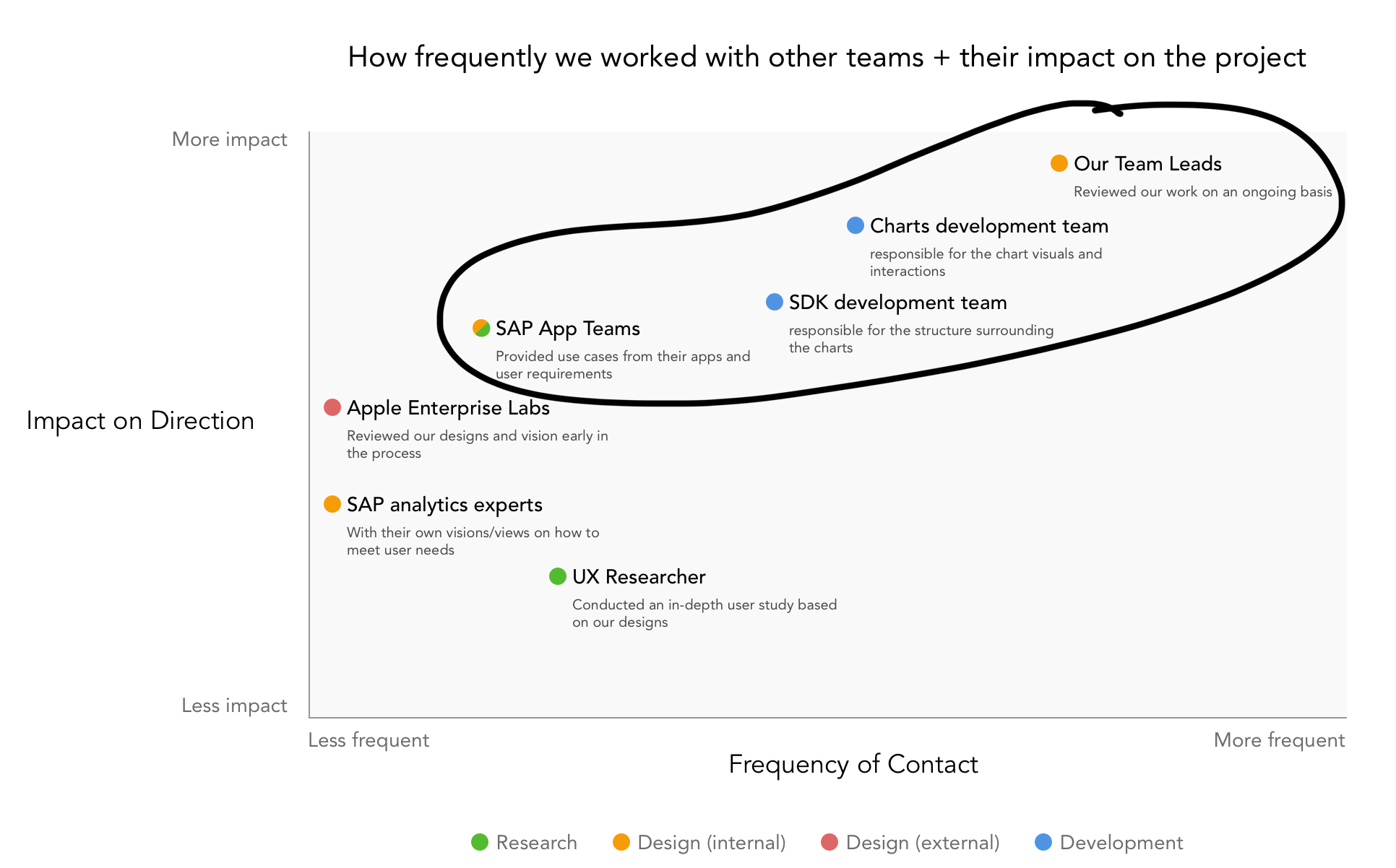
We also learned where our project fit within the larger SAP ecosystem, and how that impacted the goals for the project.
- Text (Text)
- Text (Text)
- Text (Text)

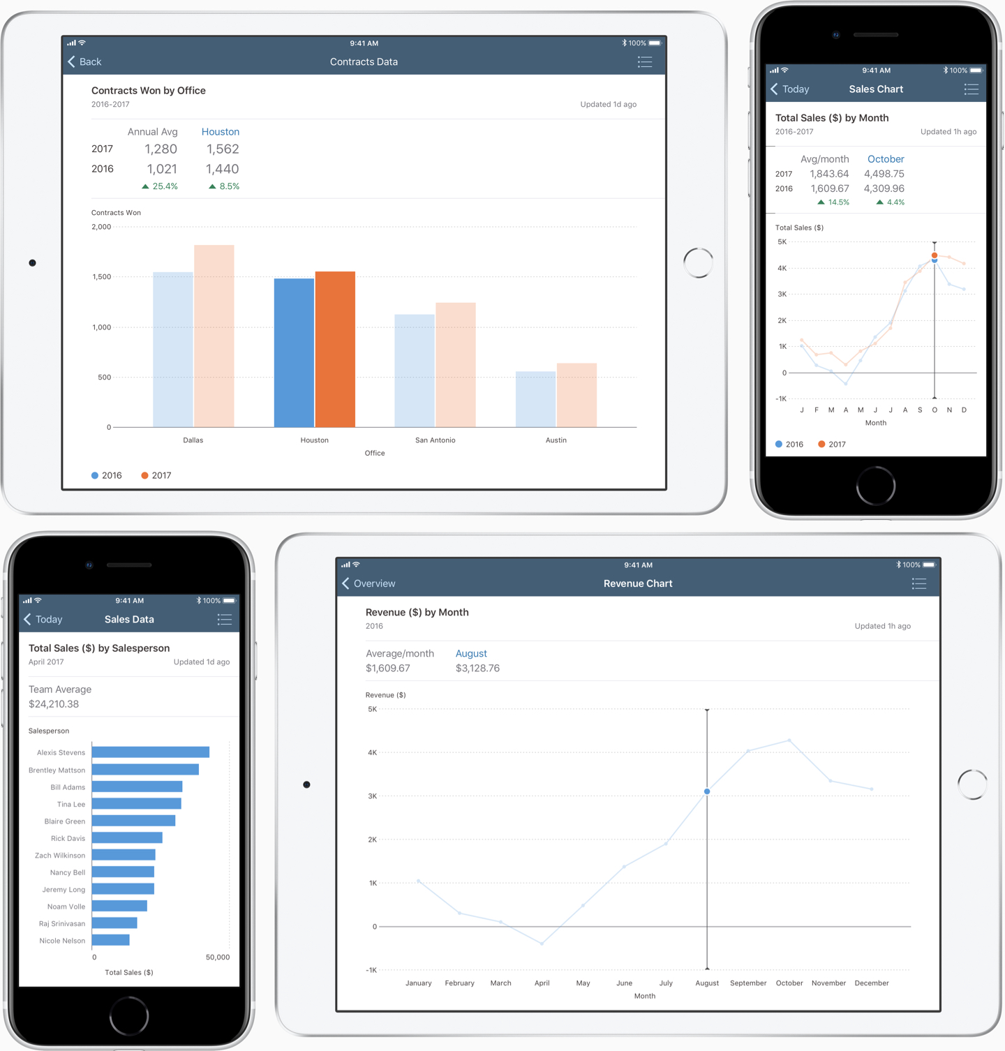
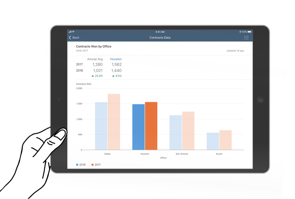
A quick look at the designs
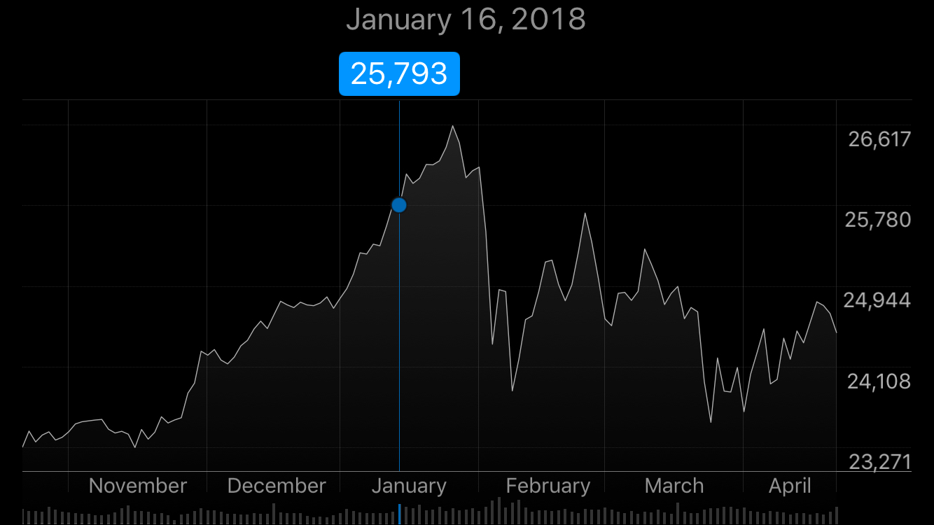
In January 2018, we released our first charts to the SDK
The first release included 4 chart types:
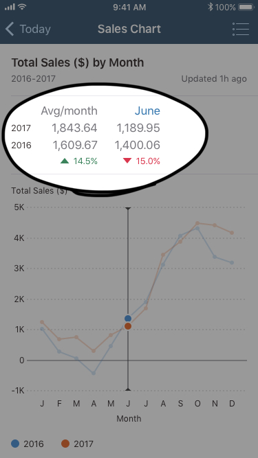
Different situations require different means of accessing data
To meet these varied needs, we created four chart variations:
Header charts
Simplified chart; summary info only, in the header, tappable link
Card charts
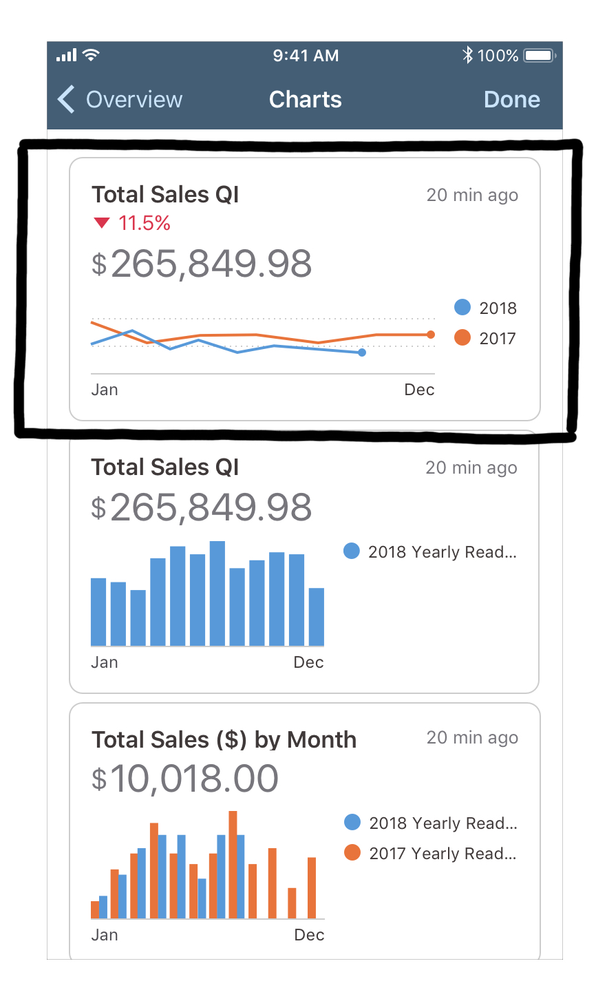
Simplified chart; summary info only, in the content area; tappable link
Static charts
Detailed chart; summary & detailed info in the content area; non-tappable link
Interactive charts
Detailed chart; summary & detailed info in the content area; full-screen; fully interactive
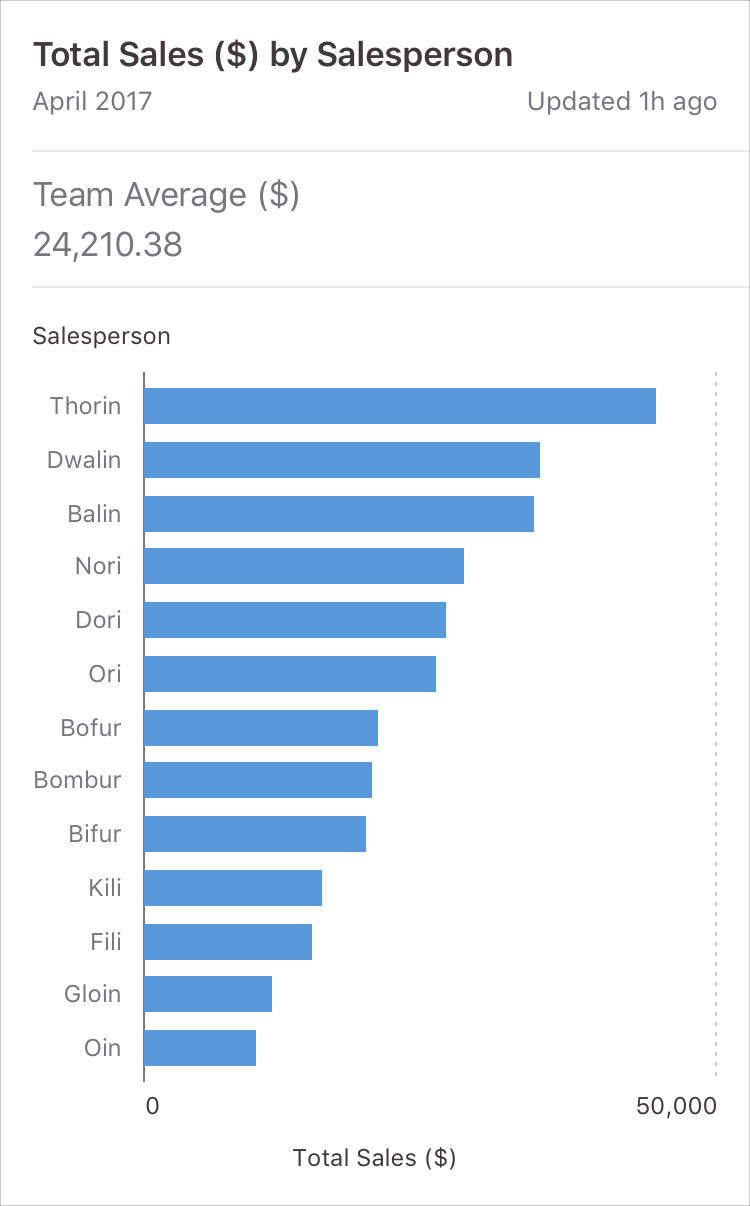
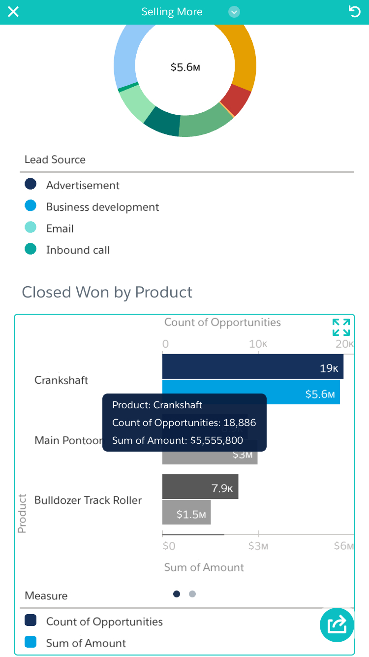
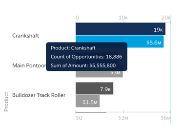
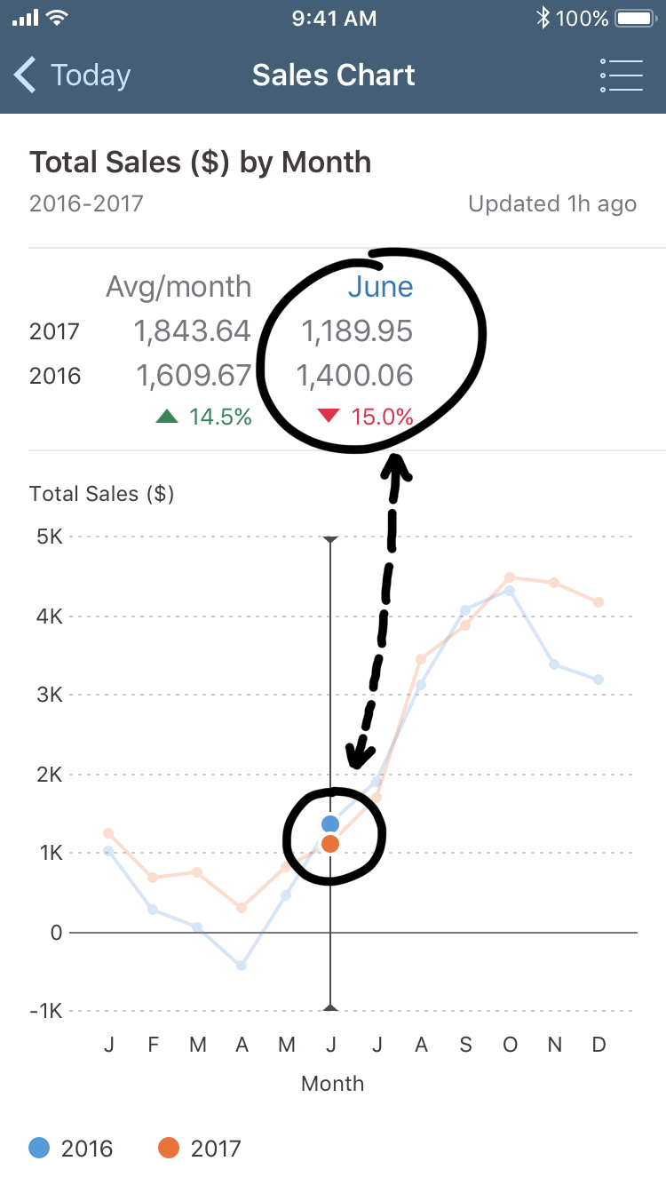
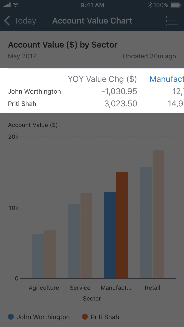
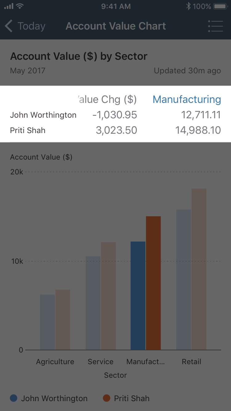
UX challenge 1: Displaying Selected Values
Making it easy to see details on chart items users tap on, given complex constraints
We evaluated the benefits and drawbacks of existing approaches to define a more robust way of showing chart values
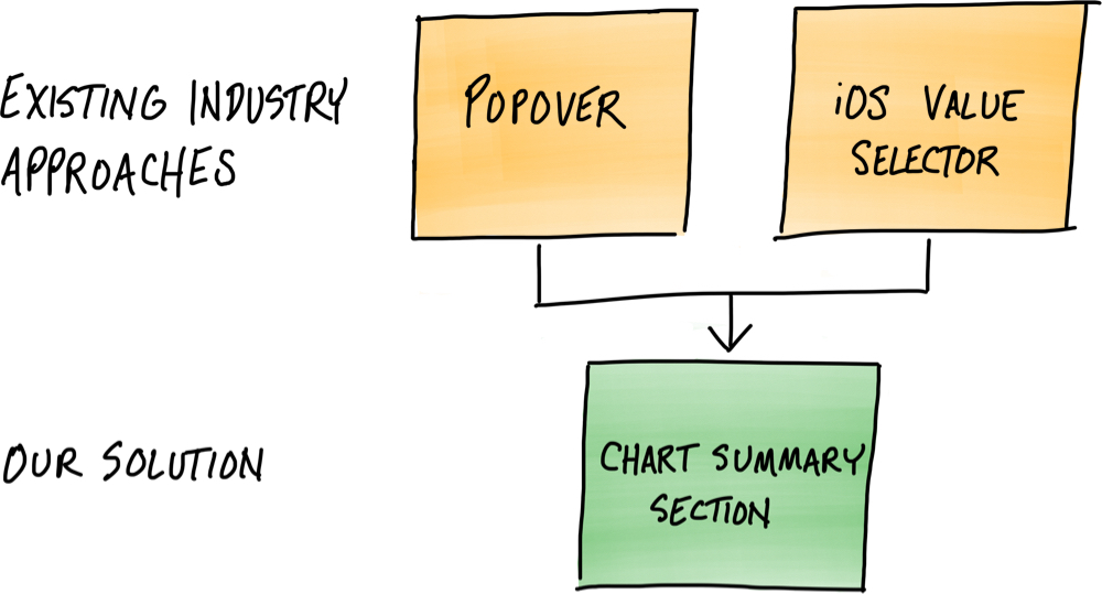
Industry approach 1: Popovers
Salesforce Einstein Analytics app
SAP BI app
Benefits: Proximity to data
Popovers allow details to be displayed very close to the related chart item, which helps clarify the relationship between the value(s) and the selected item.
Salesforce Einstein Analytics app
SAP BI app
Drawbacks: Blocking data, using small text
Particularly on a small screen, popovers can end up partly or completely blocking other chart items.
They can also be quite small, meaning their text content can become tiny.
Salesforce Einstein Analytics app
SAP BI app
Drawbacks: Apple does not approve of them on iPhone!
Moreover, Apple recommends not using popovers on iPhone, which was a key limiting factor when working in partnership with Apple.
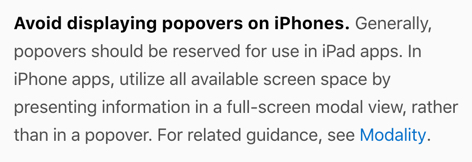
https://developer.apple.com/ios/human-interface-guidelines/views/popovers/
Drawbacks: Popover + modal is disruptive and inconsistent
If we followed Apple’s guidance above and used a popover on iPad but a full-screen modal on iPhone, this would have presented two more challenges:
Modals are more appropriate for focusing attention on a discrete task like data entry than for quickly reviewing chart data.
We wanted to find a solution that would be consistent, regardless of the user's mobile device.
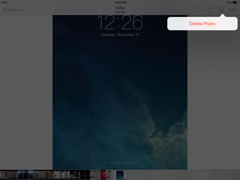
Popover on iPad (Photos app)
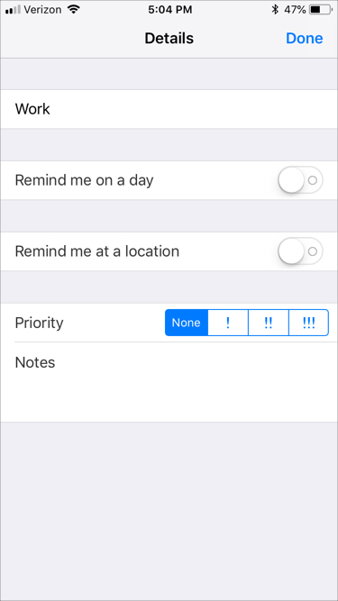
Popover on iPhone (Reminders app)
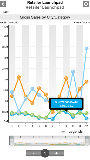
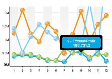
Industry approach 2: iOS value selector
Enter Apple’s iOS value selector, used to display chart values as the user scrubs through data.
Benefits: Selector does not block data (on horizontal charts)
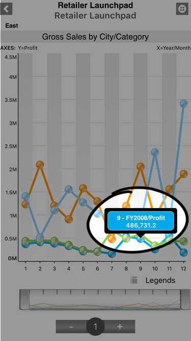
This value selector works well for charts where data is arranged horizontally (such as a column or line chart).
The selector has a dedicated row that allows it to move left and right and expand/contract to fit its contents without blocking underlying information.
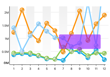
Drawbacks: In other cases, the selector blocks/shrinks content
When used on a horizontal bar chart, however, the value selector starts to break.This value selector works well for charts where data is arranged horizontally (such as a column or line chart).
The selector has a dedicated row that allows it to move left and right and expand/contract to fit its contents without blocking underlying information.
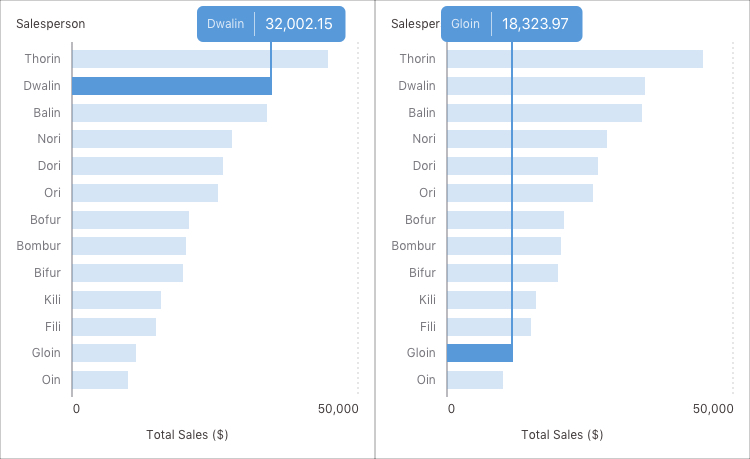
This in turn makes it harder to compare the lengths of the bars.
We’d been tasked with finding a solution that would scale across a variety of chart types.
We needed to find yet another direction.
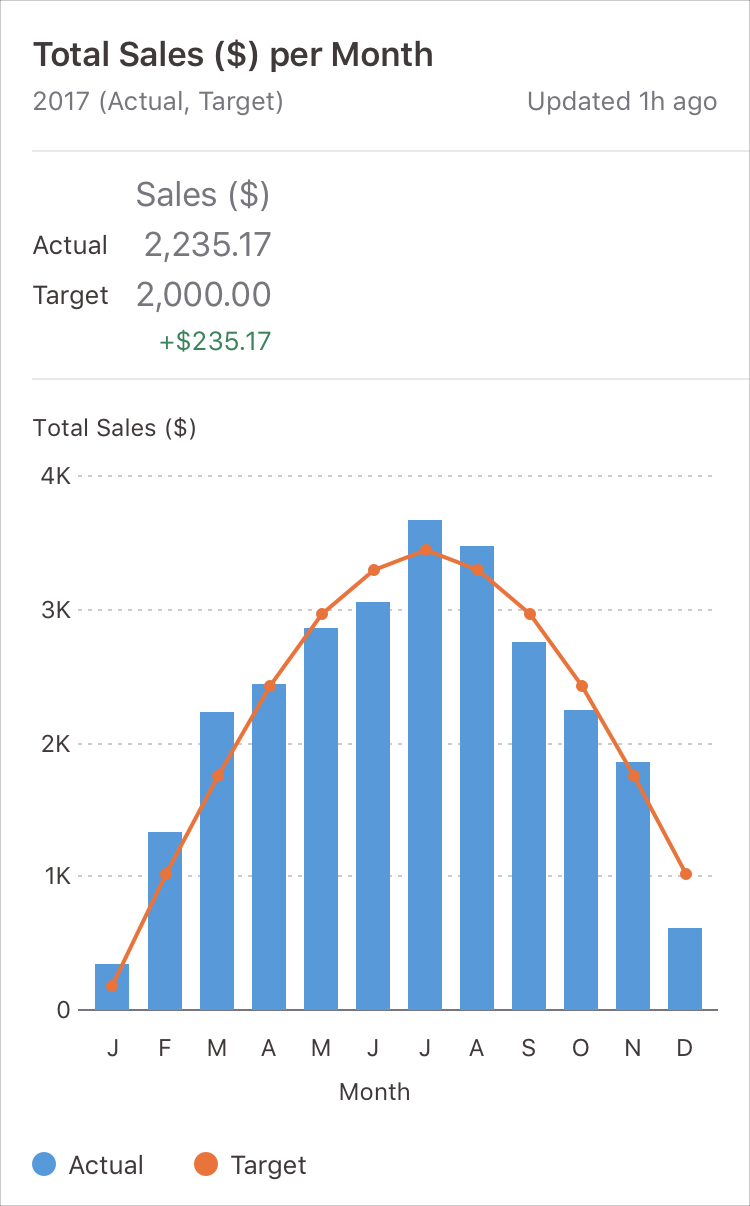
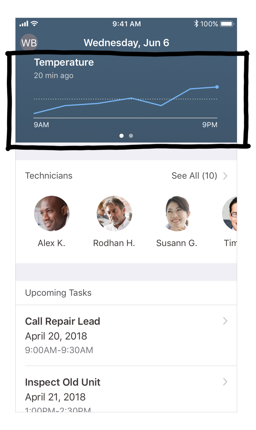
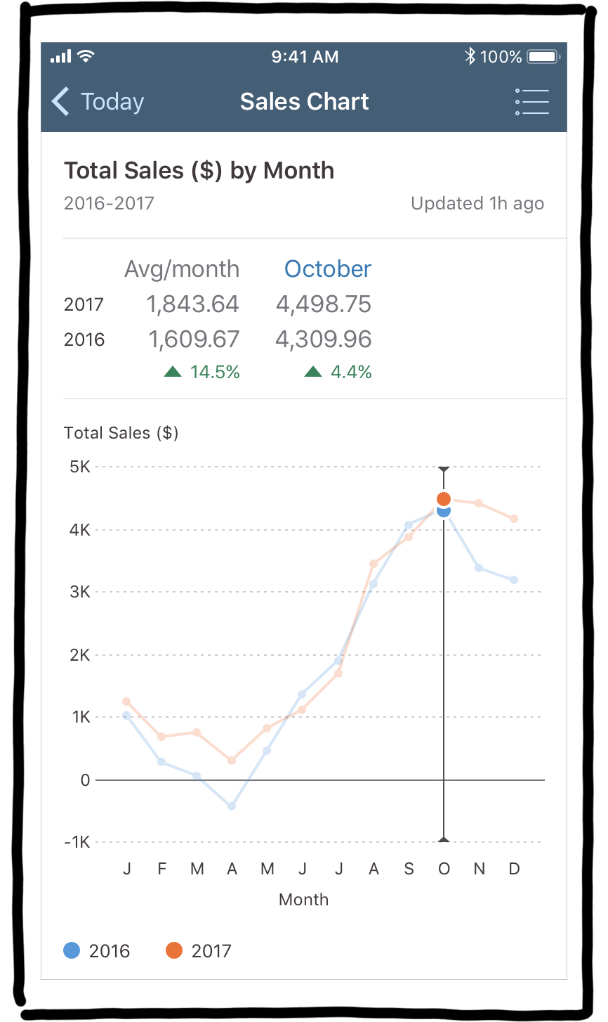
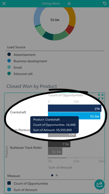
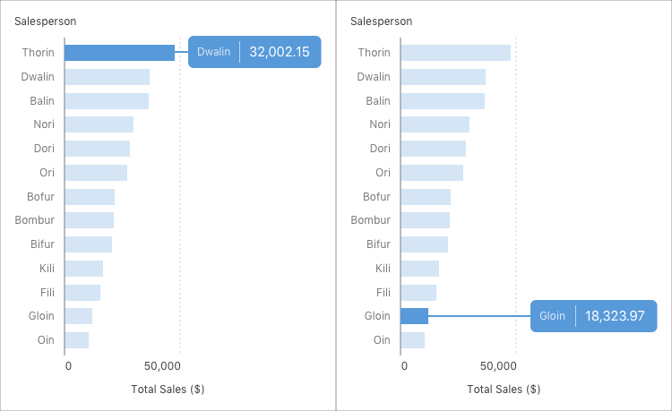
Our approach: Adding a dedicated summary section above the chart
Benefits: Consistent placement, ease of comparison, larger text
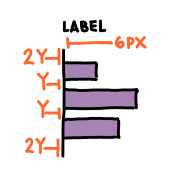
* In SAP Fiori for iOS, we avoid using text smaller than 12pt; the selected values are 17pt, with the trend and series labels at 13pt
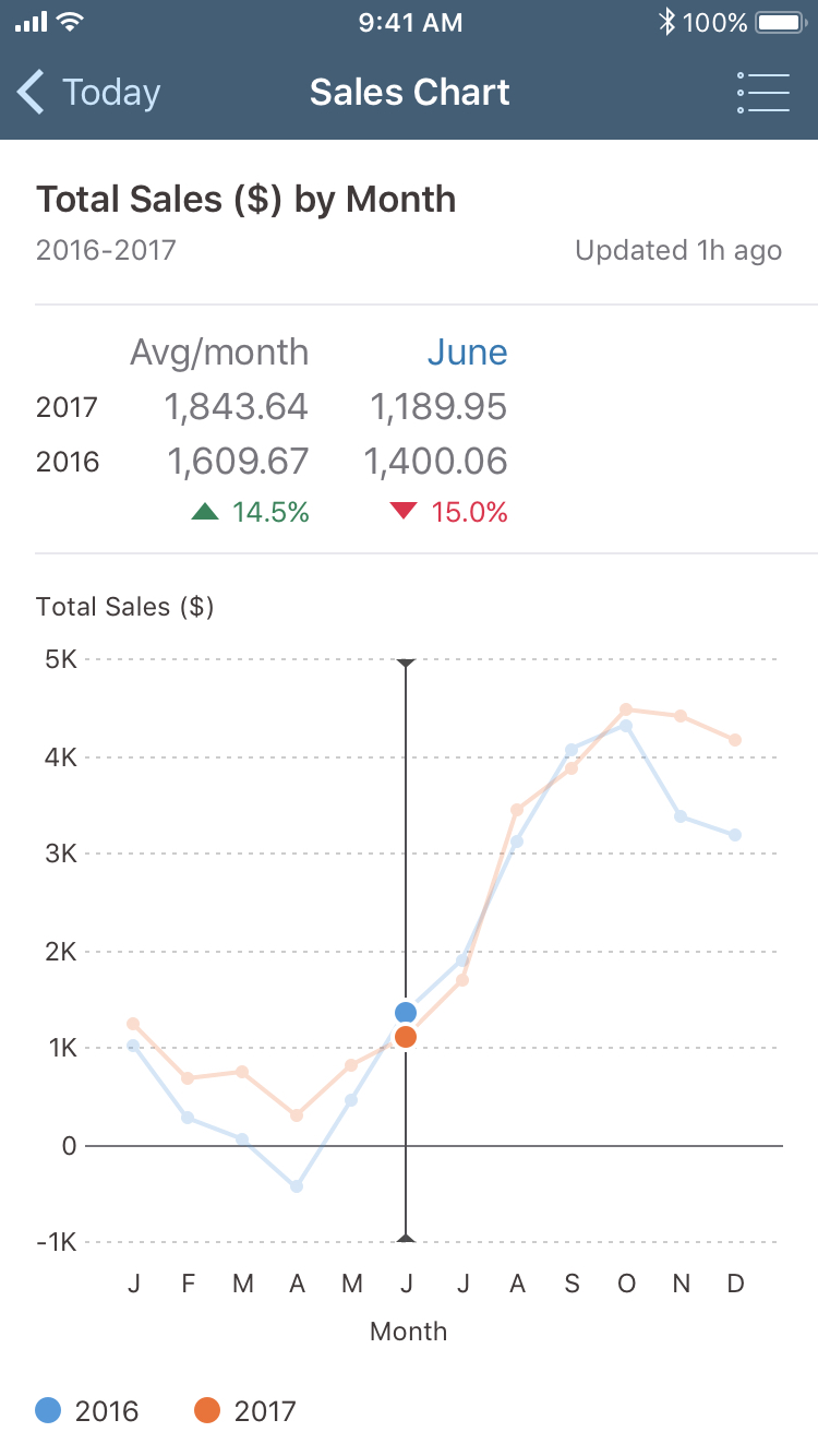
Drawbacks: It adds distance to the data
The greater the distance, the higher the possibility of the user experiencing a disconnect between action and result.
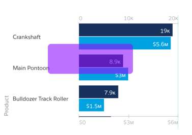
Scalability was a key consideration to our design direction
End users may have small or large data sets, may need to display one or multiple series at once, and may have a range of visual accessibility needs.
We felt the strengths outweighed any limitations
UX challenge 2: Designing for flexible content
How can we ensure our components are flexible enough to handle a range of content types for users around the world?
We considered two key attributes of users' content
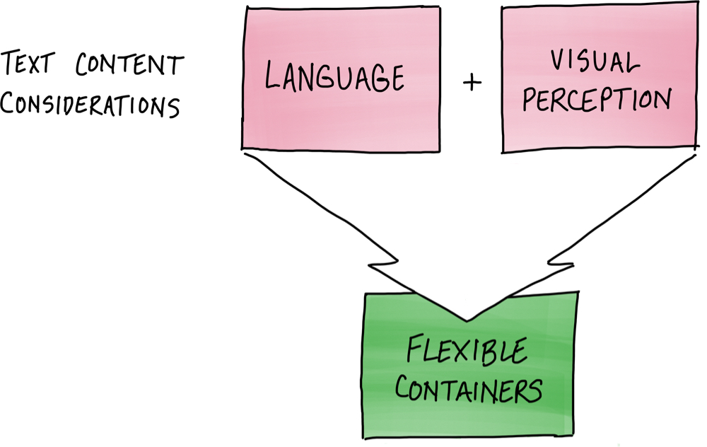
Our charts needed to work, irrespective of the user’s language
When the user changes the device's language from English to German, there is a clear difference in the length of content on screen.
Even for a component as straightforward as a table view cell, we can see how the spacing in the German version is much tighter than that of the English version.
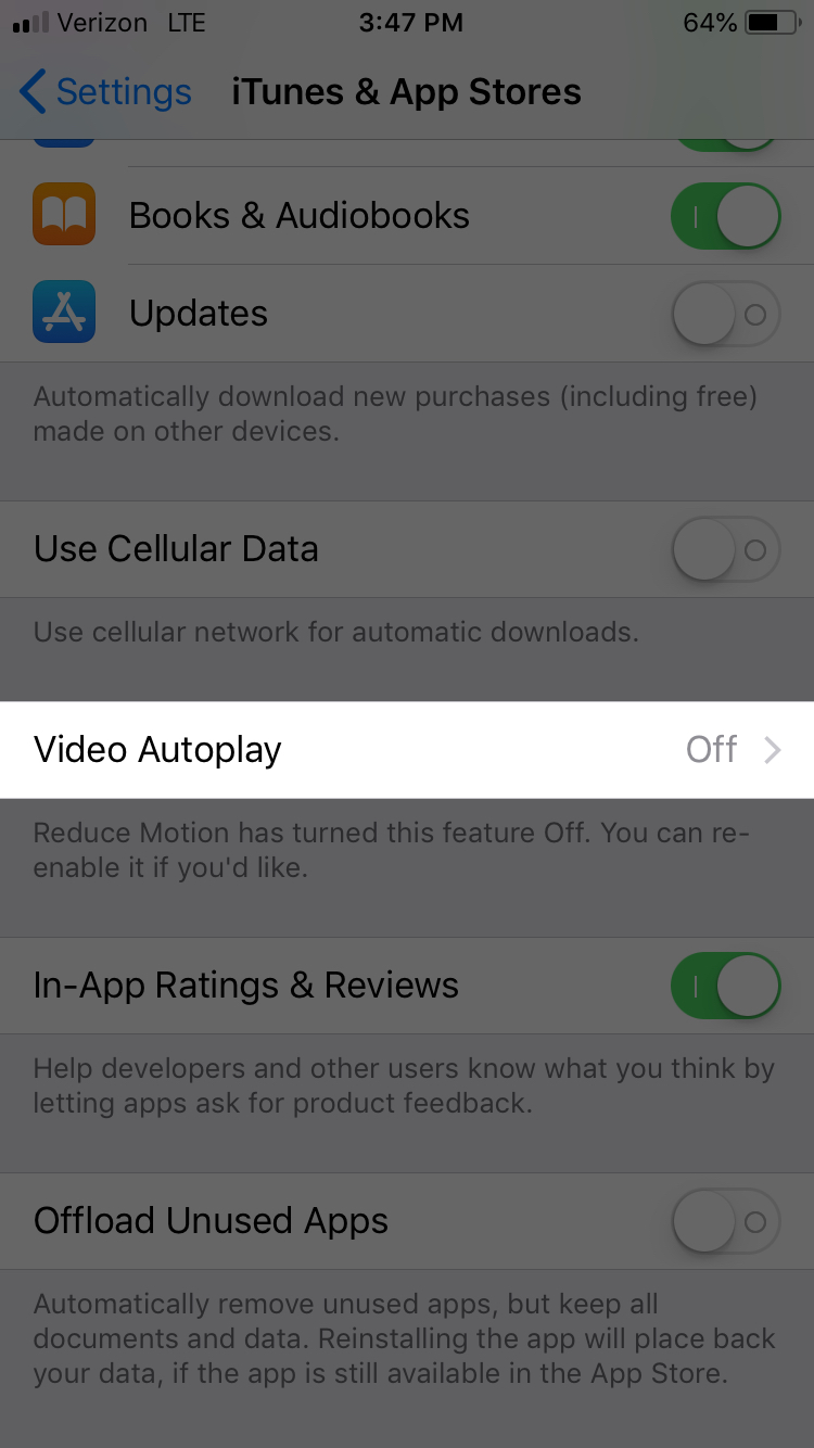
Settings in English
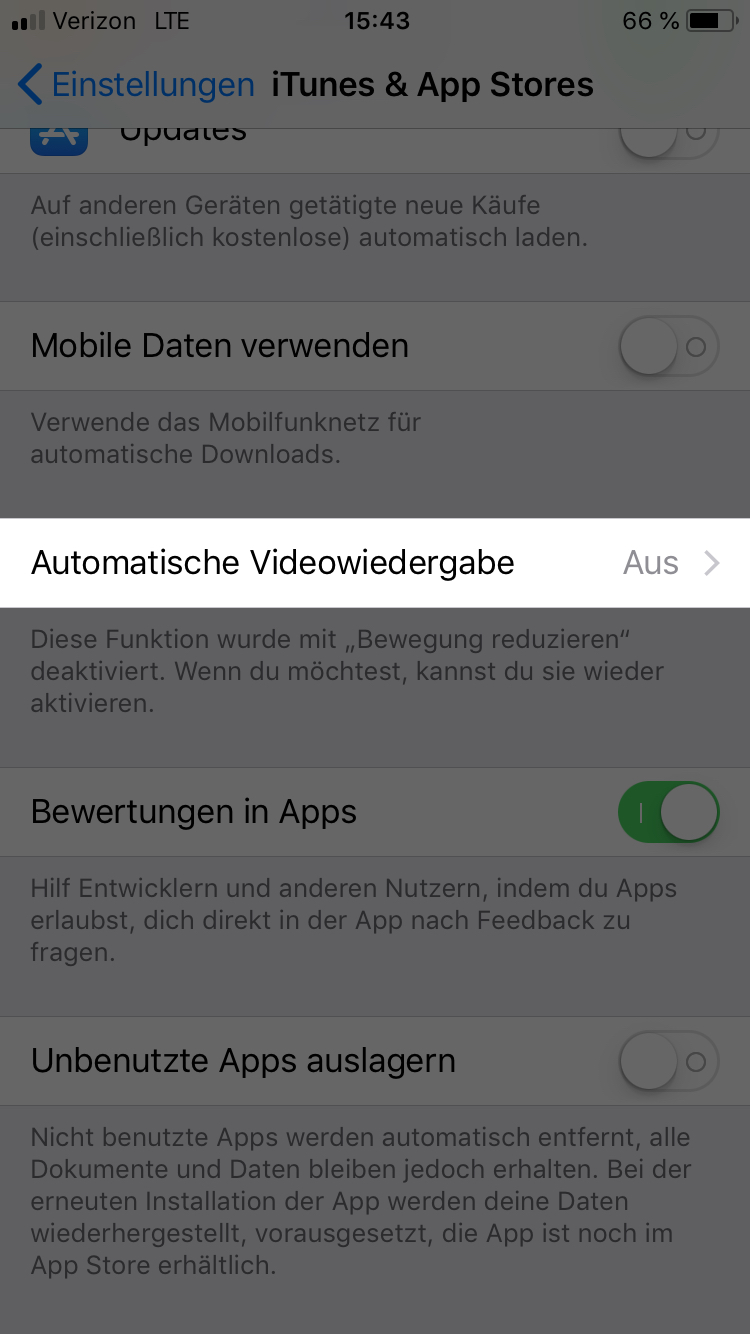
Settings in German
Our components also needed to support large text
However, in the German version, the cell contents run off the edge of the screen, forcing the user to drill in to read them.
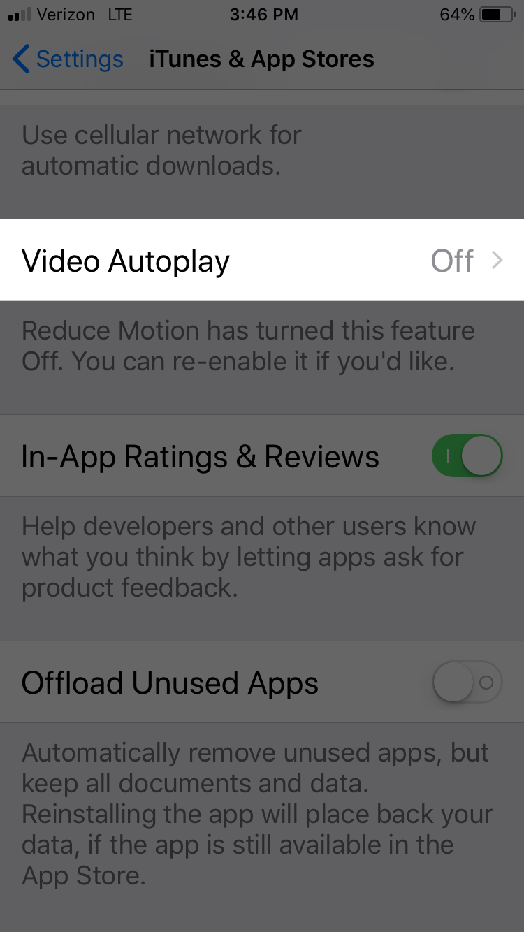
Settings in English with larger text
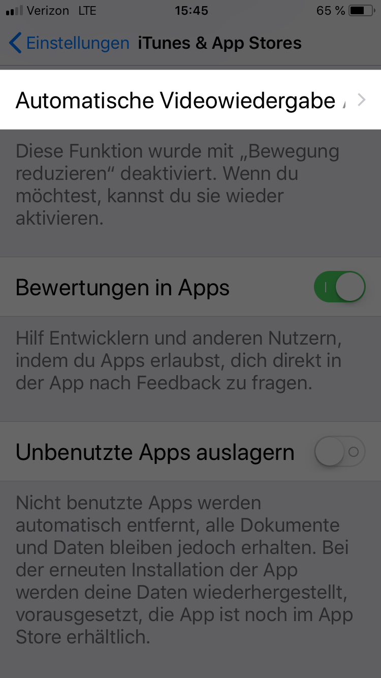
Settings in German with larger text
Our solution: Ensure the content container was flexible
Summary section before scrolling
Summary section after scrolling
We tested whether our component met accessibility standards
We were able to confirm that most content scales appropriately and remains readable even at the max size.
However, in some cases content became hidden when large text was enabled.
Testing helps us to detect these flaws and ultimately learn from and fix our designs, to ensure our components are accessible to as many users as possible.
UX challenge 3: Encouraging best practices
How can we guide app teams to consume our components in ways that will best support their end users?
We shared guidance with external teams on how to use our components via in-person and online methods

Our online guidelines offered a detailed and persistent source of learning
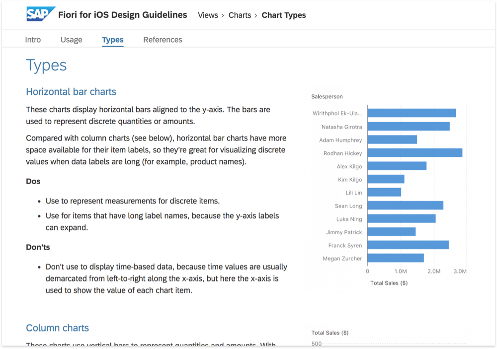
https://experience.sap.com/fiori-design-ios/article/chart-types/
Our in-person training workshops provided hands-on, intensive coaching

Looking ahead
The team continues to refine our product vision